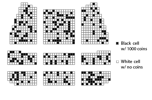
Figure 1: You’ve been given a random ticket to a performance. What are your chances for getting a black seat?
Risk theatre is a variant of icon arrays, where we color the seat map of a theatre according to some proportion we want to communicate. This kind of visualization is cute but does it really help people “contextualize” a decision involving probabilities and risks?
I ran a pilot study on MTurk and performed a power analysis before shelving this project.